When you create a new Lightning component you create what Salesforce calls a bundle. Below is an image of a bundle generated in the Developer Console and a brief explanation describing the purpose of each file.
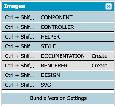
- COMPONENT: This contains the markup
- CONTROLLER: This contains functions that handle events
({
  handleSelectedSObject: function(component, event, helper) {
    helper.processObjectHelper(component, event, helper);
  },
  handleCustomEvent: function(component, event, helper {
    helper.processEventHelper(component, event, helper);
  }
})
- HELPER: This contains functions that contain business logic and reusable code. It is best practice to pass in component, event and helper but it is not necessary.
({
  processObjectHelper: function(component, event, helper) {
    var customAttribute = component.get(‘v.customAttribute’);
  },
  processEventHelper: function(component, event, helper) {
    component.set(‘v.customAttribute’, ‘new value’);
  }
})
- STYLE: This applies encapsulated CSS to the component
.THIS {
  background-color: white;
}
.THIS.customClass {
  background-color: red;
}
- DOCUMENTATION: This is an optional file containing additional information
- RENDERER: This is an optional file used to customize the default rendering behavior of the framework
({
  render: function(component, helper, event) { },
  rerender: function(component, helper, event) { },
  afterRender: function(component, helper, event) { },
  unrender: function(component, helper, event) { }
})
- DESIGN: This is a configuration file is used to expose attributes to the setup section of the Lightning App Builder
<design:component label=”Example Component”>
  <design:attribute name=”configurableAttribute” label=”Configurable Attribute” description=”Configurable Attribute” /></design:component>
- SVG: Used to store custom SVG used for the component
The simplest components only need the component file. If you want to add custom JS code, you’ll need a controller and helper.


No comments:
Post a Comment